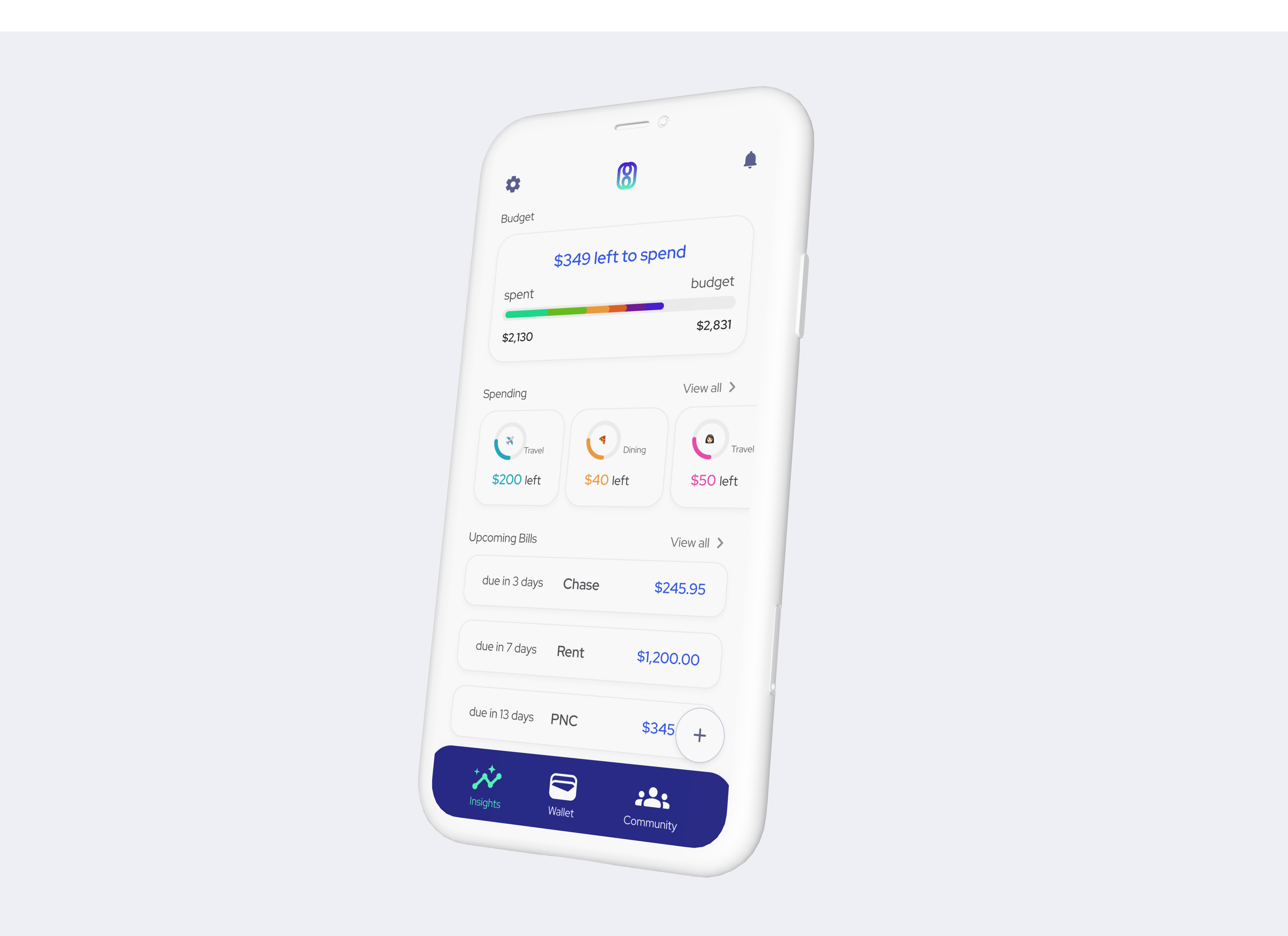
I was an early-stage design founder of a financial budgeting app focused on financial transparency. Traditional tools track spending, but users lacked context—was their spending normal? Our solution introduced community spending comparisons to provide realistic benchmarks and reduce financial anxiety. I led branding, design system creation, and UX, crafting a pitch deck, working prototype, and landing page to validate the concept. User research refined our approach, ensuring an intuitive, engaging experience that empowers better financial decisions.
Starting from scratch, I gathered inspiration and created 3 distinct style tiles to help orient the team towards a brand direction.

I was inspired by the upscale atmosphere of many banks and financial communities. I combined rose gold, navy blue, gradients, and sharper typefaces and icons. While this was my favorite aesthetically, we agreed it was too "exclusive" and "upscale" for the brand, which we wanted to feel more "welcoming" and "open".

I wanted to test a style that was colorful, illustrative, and rounded. I anchored that in this concept of a financial locker (similar to a gym or school locker) which is reminiscient of both personalization and security..

This style reduces all the noise and leads with strength & minimalism. I was inspired by pop art & 2D design that features unique fonts, bold colors, and strong lines. I would say this was the weakest option based on feedback from the team.

Ultimately the team wanted me to combine the first aesthetic option with the playful and rounded colors of the second option. I did so in this style tile, which defined the rest of the brand direction.
I built a scalable design system in Figma, including fonts, colors, and reusable components, to maintain consistency across the app. This streamlined my workflow, enabling me to rapidly produce and iterate on wireframes while ensuring a cohesive visual identity. Centralized styles also allowed for quick updates, keeping designs flexible and efficient.
I developed a diverse color palette to accommodate the app’s extensive charts and graphs, ensuring both visual harmony and usability across light and dark modes. Each color was carefully tested for WCAG AA compliance, guaranteeing sufficient contrast and accessibility before being implemented in components. This approach balanced aesthetics with inclusivity, making data clear and readable for all users.

I selected Red Hat Display for its clean, modern aesthetic and geometric sans-serif structure, which ensures clarity and readability. Its even strokes, tight spacing, and tall, open letterforms create a sleek yet approachable feel, making it ideal for both data visualization and user-friendly interfaces.
 Full Design System
To build excitement for Momo while development was underway, we needed a marketing landing page to drive sign-ups. I designed high-fidelity device mockups, curated engaging photography, and created a subtle loading animation to enhance the visual appeal and bring the brand to life.

Soft gradients and light backgrounds keep the focus on the application while the green is reserved for calls to actions and sparse decorative dollar signs.

We conducted user interviews using a fully functional prototype to validate the design. Feedback was overwhelmingly positive, and key insights helped us identify areas for refinement. These improvements were incorporated into the final iteration, ensuring a more intuitive and user-friendly experience.
Clear Data Visualization: A line chart (left) shows spending trends over time, while a radar chart (right) breaks down category comparisons—helping users quickly spot spending patterns.
Personalized Insights: The “Peer Insight” tip provides contextual takeaways, making the data easier to interpret.
Encouraging Financial Literacy: A curated content section suggests relevant financial articles, promoting better decision-making.


This screen provides a high-level financial snapshot, helping users track their spending and upcoming bills at a glance.
Budget Tracker: A visual spending curve shows how much remains vs. how much was spent, making it easy to assess financial health.
To Review: Highlights recent transactions that may need user attention, encouraging active financial engagement.
Spending by Category: Displays how much is left in different spending categories to help users stay within their limits.
Upcoming Bills: Lists due dates and amounts, ensuring users are prepared for upcoming financial obligations.
Navigation: A bottom nav bar provides quick access to insights and community features.

Category Budget Bar: A progress bar visually indicates how much has been spent vs. what remains, preventing overspending.
Transaction Breakdown: Lists recent purchases, helping users identify spending habits and patterns.
Insights Tags: Highlights the biggest purchase and recurring expenses, bringing attention to key spending behaviors.
Search Function: Allows users to quickly find past transactions within the category.


This project taught me how to think like an entrepreneur and build a product quickly from scratch with no referance point or design system. I loved the creativity and autonomy I had to build something and see it come to life. The process—from crafting a strong visual system to testing with real users—was a fun challenge, and the end result is something that feels clear, intuitive, and genuinely useful.